
When it comes to graphic design, the resources on basic principles and best practices are endless. Designers learn how to use color, typography, imagery and form to convey powerful and important ideas. However, with that comes a responsibility to ensure that everyone can access what they have created. Enter accessible design!

Designing for accessibility means being inclusive to the needs of your audience, especially those with disabilities. You could dive deeply into the accessibility of each and every element and principle of design, and how it would differ depending on your medium and audience. In this blog, I will be introducing you to only two of those elements: color and typography. For graphic design, these are two of the most important features that influence viewer experience and play a crucial role in the success of your design. While this blog will get you started, there’s a lot more to dive into.
Some Statistics for Thought
According to the NIH, color vision deficiency (a.k.a. color blindness) occurs on average in about 1 in 12 males and 1 in 200 females worldwide, with red-green color blindness being the most common form of deficiency. Dyslexia is considered to be the most common language-based learning disability. It is estimated that approximately 10% of people have a form of dyslexia, but that number could also be as high as 17%. With just two examples, we can already see why there is a need for designing with accessibility in mind.
COLOR
Designers can spend hours messing around with color, tweaking different palette combinations and adjusting hues to best represent various ideas. But what if all of that hard work was completely lost on the viewer?
Everyone’s eyes are different, therefore everyone perceives color in different ways. Creating an accessible design means considering the culture of your audience, people with color blindness, low-visual acuity, those with different cultural backgrounds than your own, and more.
Boost Color Contrast
People with low vision can find it difficult to read text from a color background if there isn’t enough contrast between the two. Contrast ratios measure the relative luminance between colors ranging from 1 to 21 (commonly written 1:1 to 21:1). The contrast ratio between text and background should be at least 4.5:1.
Additionally, poor contrast between foreground and background colors can be hard to see for users with low vision. When designing, an easy way to ensure contrast is to opt for complementary color combinations. There are a multitude of apps that help you check your contrast and determine if it passes accessibility thresholds. Contrast Ratio is an easy-to-use tool that immediately calculates your score after inputting color codes.

(credit: vwo.com)
Also try to avoid bright or loud colors together, as they can create an “afterimage,” which causes the colors to interfere with one another. Bright yellows and neons can also be uncomfortable or unsettling to users on the autism spectrum. However, it's important to keep in mind the target audience. For example, bright colors could be the staple of a brand or integral to certain messaging. Incorporate as many accessible principles as you can, but the target audience should always come first.

(credit: University of Arkansas TIPS)
Don’t Make Color the Only Identifier
If you’re using color alone to make critical information understandable, people with low visual acuity or color blindness will have a hard time accessing your content. Add other visual cues, such as patterns, shapes, or icons. As a test, print out your design in black and white and see if you can still understand everything on it.
The meaning behind color can also differ culturally. In Western cultures, red often signifies negative and green signifies positive, but the opposite can be true elsewhere in the world. For example, in Western cultures, red can represent energy, passion, and love. But in some African cultures, red is associated with death. Always add non-color identifiers such as icons or text.

(credit: uxbooth.com)

(credit: uxcellence.com)
TYPOGRAPHY
Typography is an important & under-appreciated tool. It can strongly affect how viewers react to a graphic. In still graphics, typography may depict the whole message. In animated graphics, it can accompany a scripted voiceover or can even make up the entire video. Therefore it’s crucial for typography to be accessible.
Font is Key
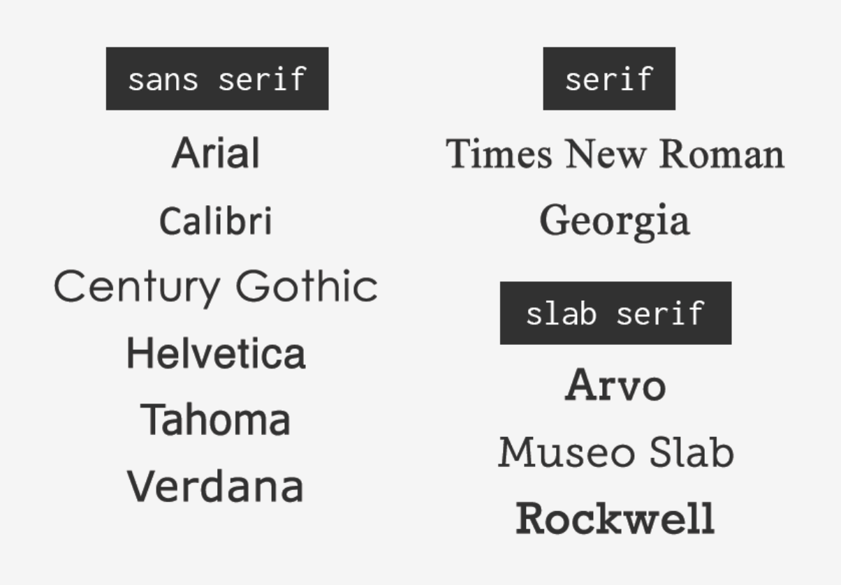
The font you choose for your design is important. The easiest way to ensure accessible typography is to stick with commonly used fonts. The font itself should be easy to read. It’s best to avoid specialty display fonts like scripts, such as Brush Script or Apple Chancery. Decorative or cursive font styles can be problematic for viewers with dyslexia. The British Dyslexia Association created a style guide for designers to use that considers people with dyslexia. Common fonts you should use include:
Sans-serif font families: Arial, Calibri, Century Gothic, Helvetica, Tahoma, and Verdana
Serif font families: Times New Roman and Georgia
Slab serif font families: Arvo, Museo Slab, and Rockwell
A design should typically have no more than two fonts (including differing weights i.e. bold, italic, regular) as transitioning between multiple fonts can be difficult for viewers with dyslexia.
(credit: envato.com)
Sizing & Spacing
For accessibility, the best practice is to limit the use of variations such as italic, bold, ALL CAPS or other styling that can interfere with readability. Small font sizes, italicized text and all uppercase text tend to be difficult for viewers with low vision. For viewers with reading or vision disabilities, it can be challenging to comprehend type that is close together without a lot of spacing. Overall, when it comes to typography, larger text, shorter line lengths, taller line heights, and increased letter spacing can help viewers.

(credit: envato.com)

(credit: envato.com)
Hierarchy of Information
Accessible typography should also guide the viewer easily through the design, from the most important idea to the least. Position, size, weight, and color of type can all be used to determine a visual hierarchy. But be sure to continue utilizing the other principles of accessibility when incorporating this into your design!

(credit: Design Shack)
Color & typography are only two of the many ways designers can make their content more accessible. It’s important to remember that each and every one of us perceives the world in a slightly different manner – that’s what makes our differences so awesome. While it may be impossible to have a design that is accessible to all at once, as designers we can work to bridge that gap in any way we can.
Resources to Continue Learning